Product
We are pleased to announce that we have just launched new features in AGILOX ANALYTICS.
The highlights at a glance
- The navigation has been improved to save space and to see the structure at a glance without sub-navigations.
- There are many new charts as well as filter and analysis options for failures and processes.
- You are now able to export tables showing failures, workflows and actions.
- You can easily export your dashboard as a PDF with just one click.
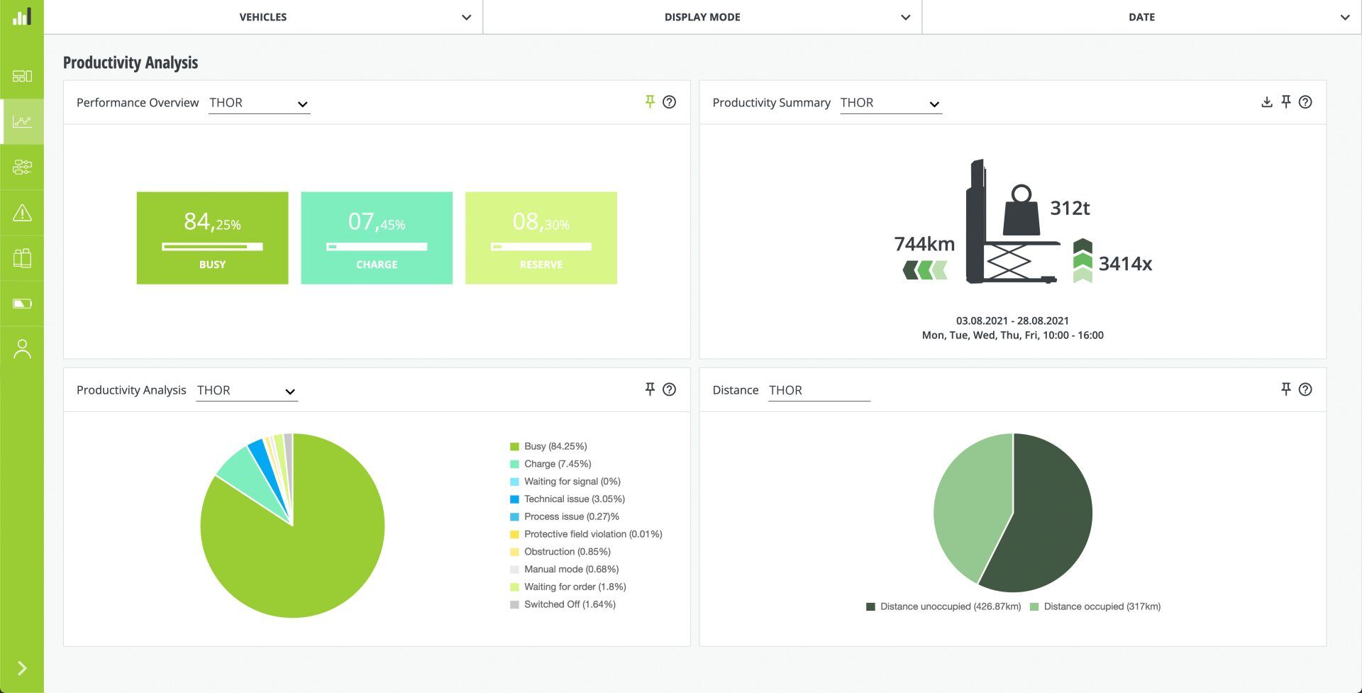
Productivity
- The charts have been divided into analysis and history.
- A chart showing the relationship between occupied and unoccupied transport distance has been added.
- For the sake of clarity, ten donut charts have been combined into one pie chart. This allows for targeted analysis using just one chart – without losing any information.
Failures
- Also in terms of failures there are many more filters and analysis options.
- Additional charts provide you with an even better overview of possible failures so that you can analyze them specifically.
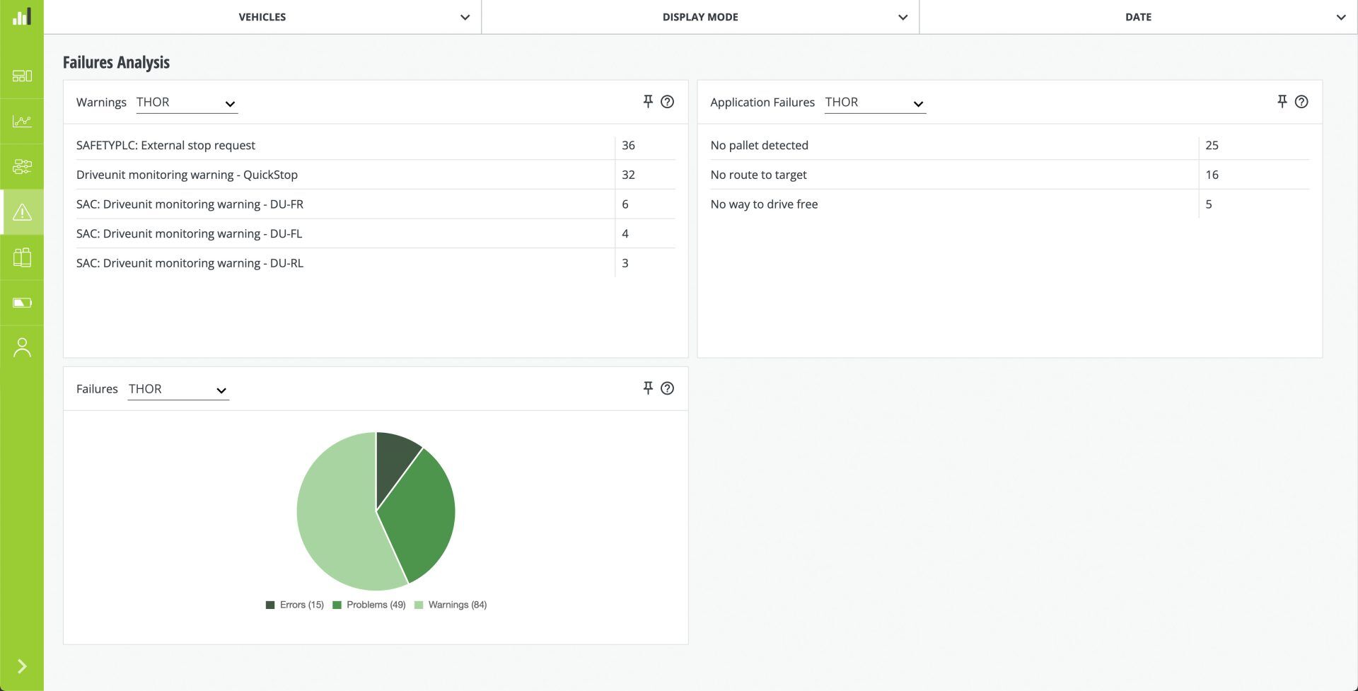
- If you want to get even more detailed information, use the filter and analysis options in the overview.
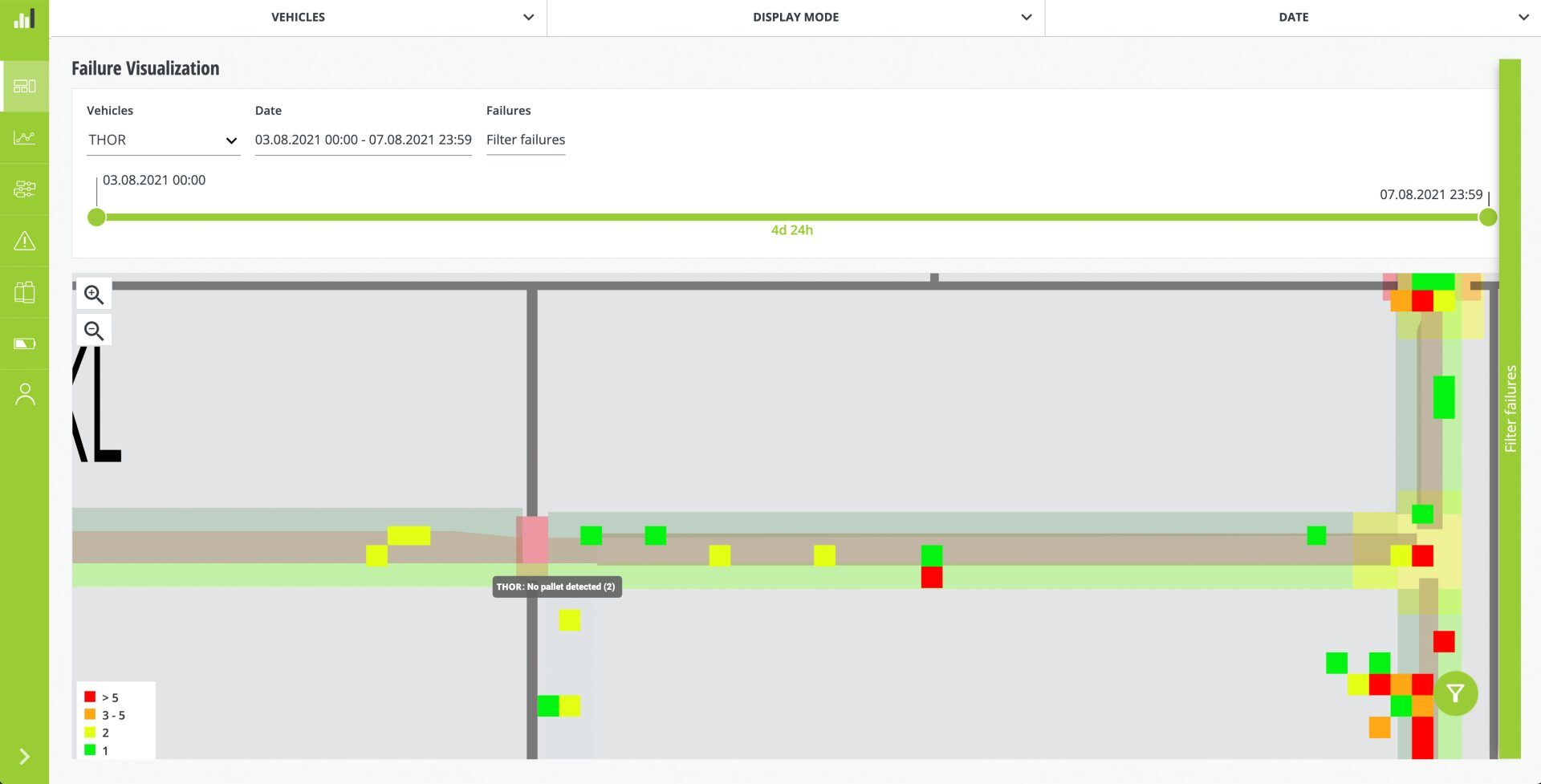
- For example, you want to get more information why there was no route to target? With just one click you jump to the failure visualization and see on the map where the errors occurred.
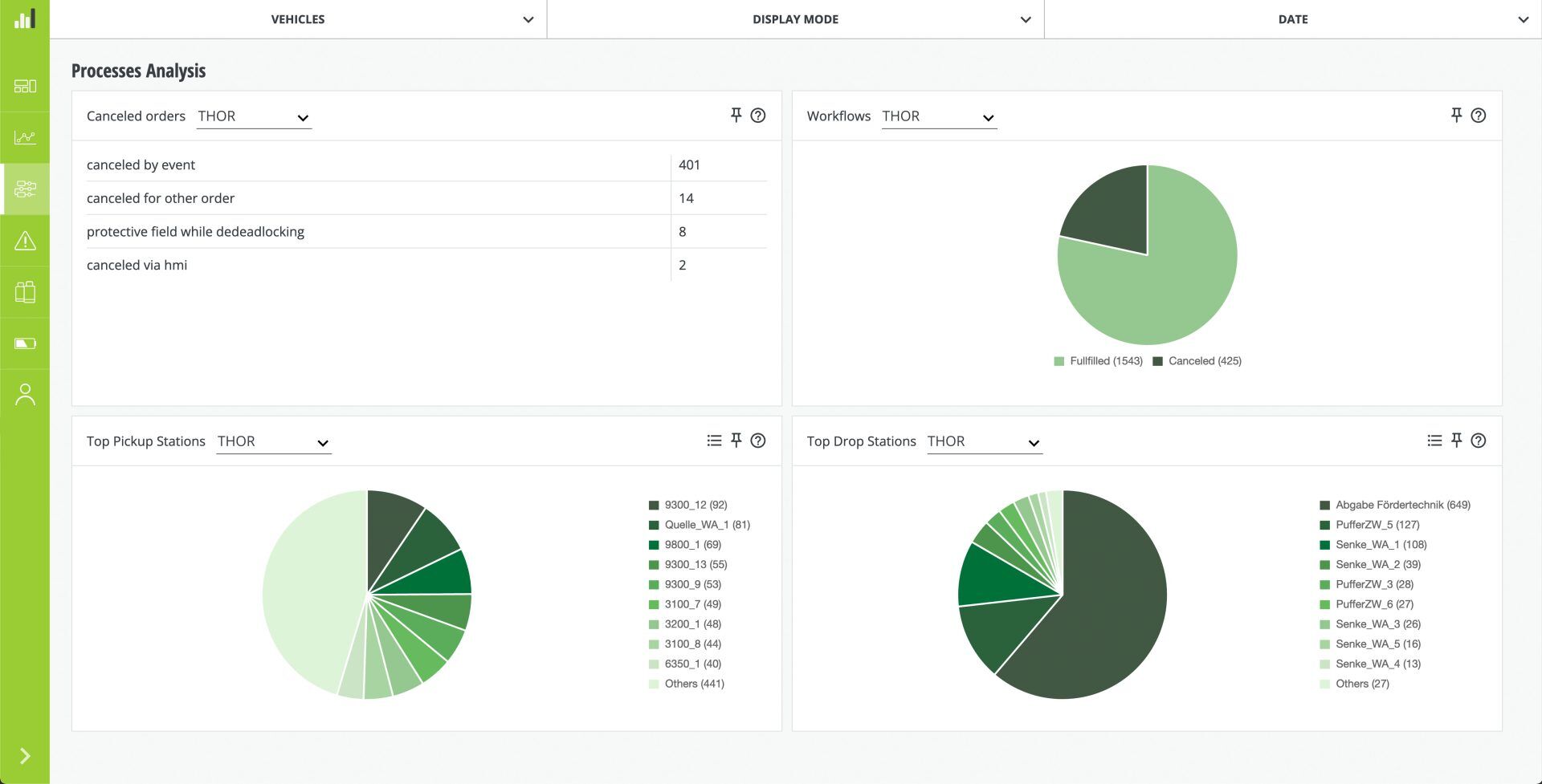
Processes
- The navigation link “Orders” has been renamed to “Processes”.
- Unlike before, there are now a number of charts, allowing for evaluations of top pick-up and drop-off stations.
- There is an overview of all workflows and actions including new filter options to analyze them in detail.